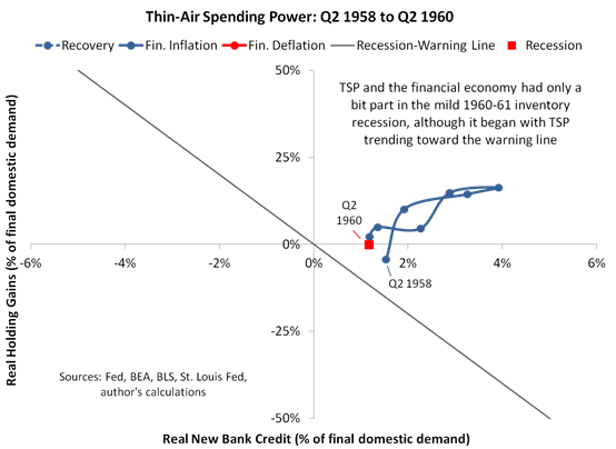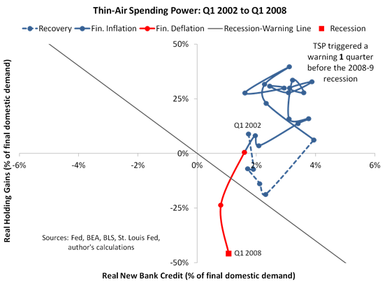
In “You Might Like to Watch This Picture as Asset Prices Fall,” we discussed a composite indicator called thin-air spending power (TSP). We also promised that the accompanying chartbook (the post that you’re reading) would track thin-air spending power during every business-cycle expansion since 1954, among other charts. Here are the business-cycle expansion charts.
TSP in an Average Expansion
Now for the other charts. In the next one, we constructed an average TSP path for the expansions shown above. Our average path includes five expansions (all of those that lasted four years or longer) for the first data point, which is sixteen quarters before the onset of a recession, and then it blends in the shorter expansions as soon as they fit completely into the remaining window.
The average TSP path becomes especially interesting when we compare it to our estimate for Q4 2018. As noted in the main article, we estimated Q4 TSP using high frequency data (including weekly data from the Fed’s H.8 report, home price data from the Case-Shiller Index and the S&P 500’s close on November 27). Here’s the Q4 TSP estimate alongside our final readings for 2018’s first two quarters.
The chart shows the Q4 estimate lying directly on top of the average TSP path at a point that’s just two quarters before the end of an expansion. That’s not to say we’re predicting a recession in two quarters time (other key indicators haven’t yet deteriorated alongside TSP as in past expansions), but the chart certainly has our attention.
(As an aside, if you’re interested in watching the Q4 estimate unfold in real time, join our mailing list for indicator updates. You can do this by sending an email with “indicator updates” in the subject line to queries@nevinsresearch.com. Note that this is different to our blog subscriptions—we only update indicators on the blog when we find the time to write an article about those indicators, meaning the blog doesn’t report most of our research.)
TSP versus the Yield Curve
For any readers who’ve decided to dismiss TSP only because they think the yield curve is all they need to forecast the economy, we have a special chart to show you. To create it, we reduced TSP to a single dimension using our recession-warning line’s ten to one ratio between the spending effects of real new bank credit and the spending effects of real holding gains. (See the main article for explanation.)
More exactly, we combined real new bank credit with 10% of real holding gains to calculate TSP in a single dimension. Then we calculated the correlation between TSP and changes in economy-wide spending (real final domestic demand) and compared it to the correlation between the yield curve and changes in spending. Here’s the comparison.
To be clear, we’re not disputing that the yield curve can help predict the economy—we think it can. In fact, if we had a longer history for other curve measures (especially for the short end of the forward curve), we would possibly see higher correlations with spending. But the measure we used (the 10-year minus the 1-year, which we chose because it has a history that goes all the way back to 1953) sits right in the middle of the mix of most popular curve measures. And based on the results for that measure, anyone who bets on the yield curve should know there’s another horse—TSP—that run laps around traditional curve measures when it comes to predicting spending.
TSP versus Spending and the Business Cycle
So the correlations tell us that TSP is closely related to spending, and the next chart shows the same relationship in line form.
Our last chart compares TSP to the last nine recessions, and once again, we can see that recent developments carry a strong warning. When TSP drops as severely as suggested by our latest estimate, a recession virtually always follows in five quarters or less, and typically less. As noted in the main article, we suggest watching this picture.


Pingback: “Thin-Air-Spending” & What To Watch As Asset Prices Plunge | peoples trust toronto
Pingback: “Thin-Air-Spending” & What To Watch As Asset Prices Plunge | Real Patriot News
Pingback: “A Recession Virtually Always Follows…” – iftttwall
Pingback: "A Recession Virtually Always Follows..." - Financial News & Business News
Pingback: “A Recession Virtually Always Follows…” | Real Patriot News
Pingback: “A Recession Virtually Always Follows…” – Wall Street Karma
Pingback: “A Recession Virtually Always Follows…” – TradingCheatSheet
Pingback: US Economy "Muddles Through" As Thin-Air-Spending-Power Slumps - NewsBanc
Pingback: US Economy “Muddles Through” As Thin-Air-Spending-Power Slumps – The Conservative Insider
Eric K.